-

 E-COMEcommerce Solutions | Food & DrinkPLACE OF ORIGINVISIT THIS PROJECT
 -


 E-COMPLACE OF ORIGINIndia's first curated marketplace brings India's finest local specialty foods, direct from the origin to your doorstep.BACK TO PROJECTVIEW WEBSITE
Discover India’s finest food with “Place of Origin”, a one stop destination for finger licking, all time childhood favorite food. Fresh locally sourced ingredients, time-tested recipes, expert hands that craft food with lots of love. That’s what makes every product on this site unique. And that’s what you deserve to have. They believe in the mantra “Eat what you Love and Love what you Eat !”
Deliverables
Place of Origin intended to showcase food brands from across India on one platform. They aimed at building an online presence to scale their outreach.
A sleek, impeccable, easy to navigate website, built with AMP technology was designed and developed by our team.
Services
Web Design & Development
Platform – Developed in Magento, the website is accessible on mobile, tablet and desktop thereby creating a impeccable user interface.The website is designed with AMP (Accelerated Mobile Pages ) technology, enabling fast page load on the mobile device. Magento is integrated with WordPress which makes it facile for feeding in blogs, feeds etc.
Website Structure
The website is structured to make it look legible and impeccable. Brief on each structure is further discussed below,
Home Page –
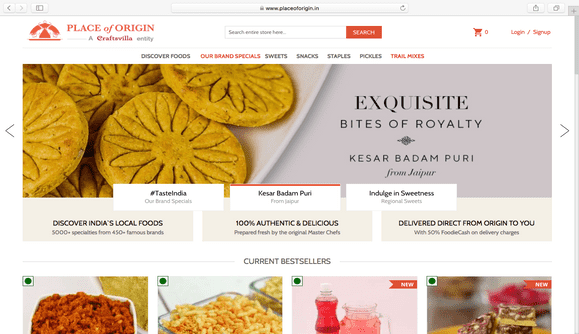
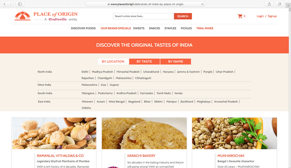
The homepage opens to a full width banner slider illustrating their range of food products, with a call to action. The navigation bar is fairly simple with categories of different food products and segregation in accordance to the region of origin.
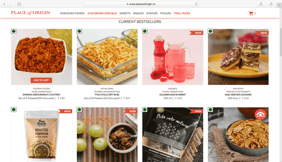
The Homepage presents a brief understanding of the product range. The products are categorized to “New Additions”,”Exclusive” and ”Bestseller”.
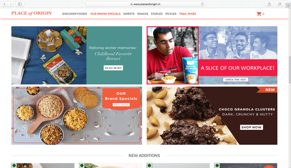
A grid matrix is designed showcasing exquisite, unique and out of the box food products compiled in a blog. The matrix also includes testimonials of customer’s experience and other delectable products with a call to action link.
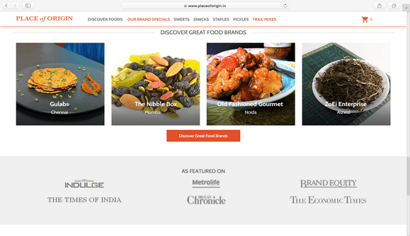
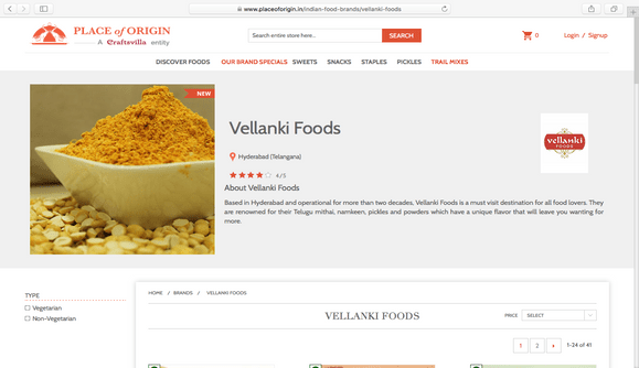
The product range is also classified brand wise. Each brand page opens to an array of delicacies with a call to action link
Product Page –
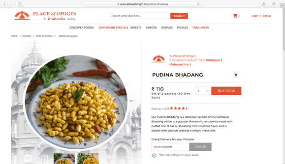
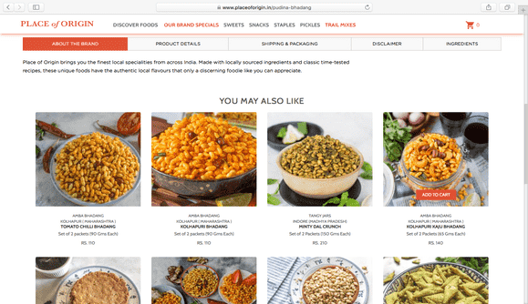
A brief on the chosen product and the customer rating is presented in the product page. The page also entails details on ingredients, brand and shipping & packaging information. Information on reward points and purchase coupons are mentioned in the product page content.
Checkout Page –
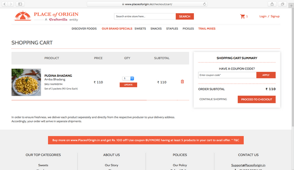
Google+ is integrated for creating a customer profile. The pop up prompted for customer details indicate offer information, enabling the customer redeeming the offers at ease.
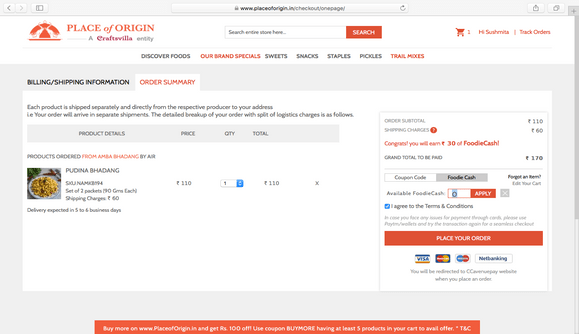
Billing/Shipping Page confirms the address to be shipped and a provision to enter new address if need be.The order summary page provides information on the products ordered, total price, shipping charges, expected delivery dates and payment gateways.
Place of Origin Ecommerce Website Preview
More Projects
Let’s chat...
but, you first!
AS SEEN ON


awards

Excellence
in Digital Marketing
Women CPO
of the year 2023
Transformational
Leaders to Watch
Most Trusted
Companies


