-
 E-COMEcommerce Solutions | Fashion & LifestylePERONAVISIT THIS PROJECT
 -
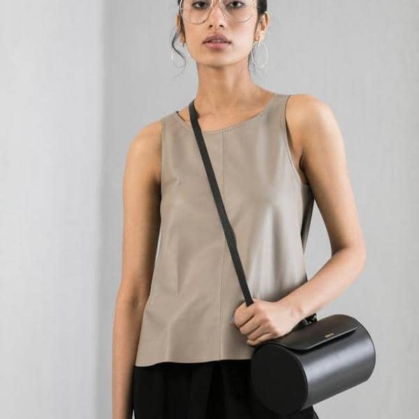 E-COMPERONAPerona wish to enrich lives with their craft. Happiness is found in creation. Perona products move with the wearer. Understanding nuances, becoming what they want to be. Perona is your companion to everyday discoveries.BACK TO PROJECTVIEW WEBSITE
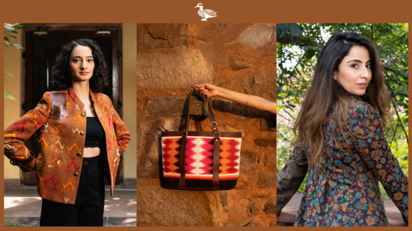
Simplistic,Timeless, Classy and Decorative are the best adjectives that describe Perona designs. With Premium leather and fabrics sourced for their purity, subtle lustre, supple texture, sumptuous feel, the Artisanal excellence and dedication to perfecting workmanship , Quality becomes a sensory experience. Perona is a wearer and the wearer is unique like the grains of the leather. Perona is an expression!
Deliverables
To elevate the brand image, Perona was seeking a capable team to develop their distinguished, out of the box and elaborate website design. The client required a clutter free design to be developed to enable an impeccable shopping experience.
Unparallel efforts have been put to represent this exquisite brand. The personality of the website designed represents the attitude of the Perona’s business. Digital Impressions developed the website on the Magento 2 platform, the latest and future of eCommerce platform. The design was developed in accordance to the detailed, modish design layout discussed.
Services
Website Development
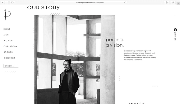
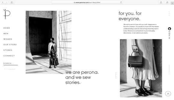
Perona stands for tailored clothing which has a subtle luster, supple texture and their designs act as a companion with the customer on their onward discoveries. The vision instilled by the perona designs are illustrated on their website, developed by our team. A bespoke parallax display and layering concept was incorporated in the website which scaled up the visual appearance. Flawless website was developed enabling a fluidic maneuvering through the pages of the website.
Platform – Perona is an epitome of creating unique, personalized experiences for their wearer. The website is designed on the new improved, user friendly Magento 2 platform. The improved version brings in new payment methods, improved checkout, more customizable options on the sales and product page and such similar options.
Home Page –
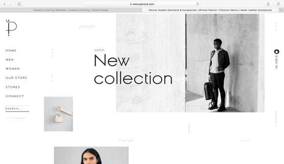
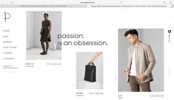
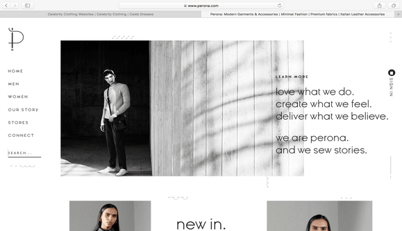
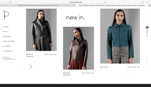
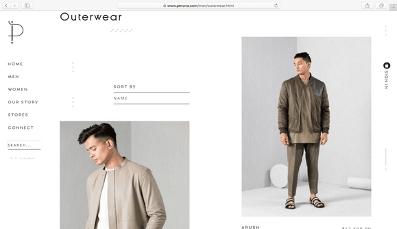
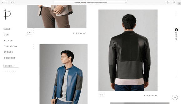
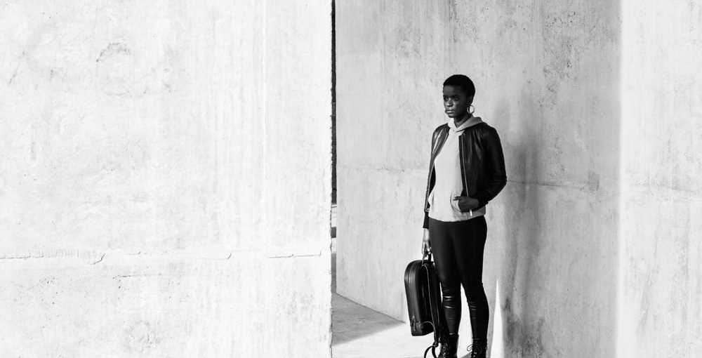
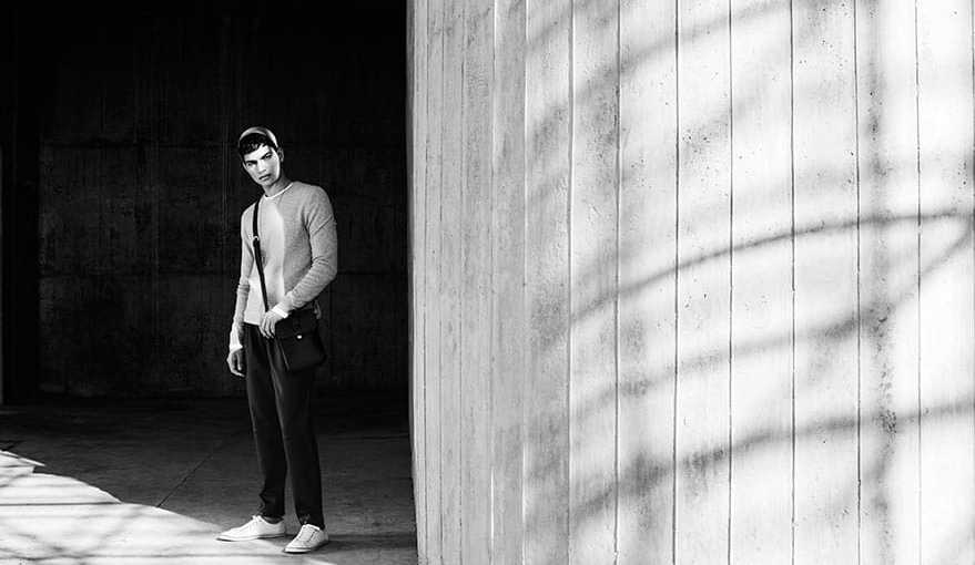
The design of the website is idiosyncratic. The design collections are displayed in rustic, monochrome, high resolution & animated images and text, creating a visual satisfaction for the customers. The products are displayed on the home page along with the price information, so as to enable the visitor shop the merchandise at ease. The intricacies and the nuances of the product is made visible through the “zoom in” feature.
A navigation bar is designed on the side of the web page which makes it easy for the visitor to maneuver through the website. The craftsmanship of Perona’s designs are an analogy to their detailed website design. The detailing of each product listed on the website is impeccable. The products are classified under the men and women wear. The navigation bar displays the sub categories under the category chosen, alternatively the customer could navigate by mouse hover on the chosen category.
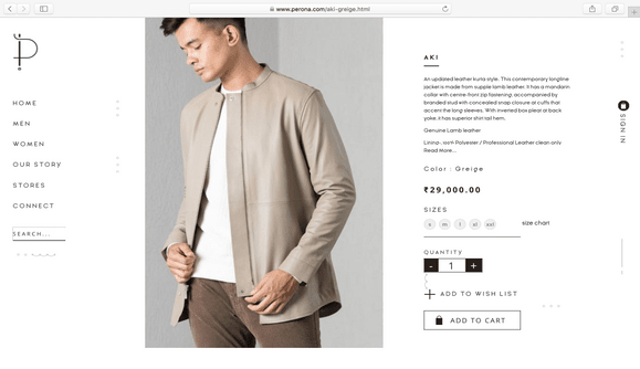
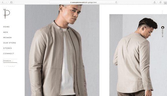
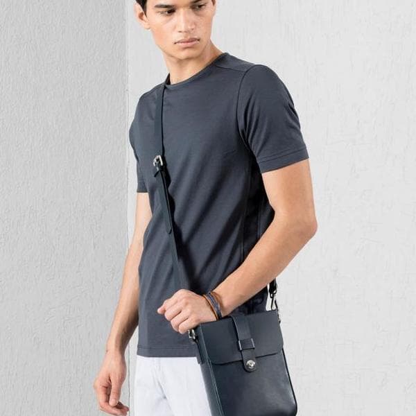
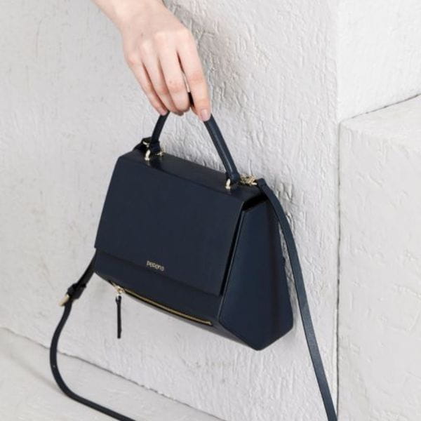
Product Page – The product is displayed with images shot in different angles for better understanding of the design specifications. The product page entails the details of the design, fabric and quantity.
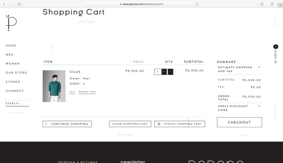
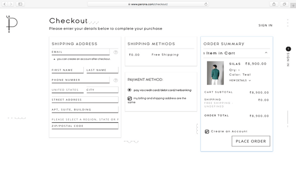
Checkout Page – The design is such that it enables a one step checkout process. The customers can key in basic details, the list of delivery locations are provided in a drop down menu. The shipping tariff automatically changed post the delivery location is keyed in. Payment mode, shipping and billing address and order summary is displayed on one page enabling the customer a clutter free shopping experience.
Perona Ecommerce Website Preview
More Projects
Let’s chat...
but, you first!
AS SEEN ON


awards

Excellence
in Digital Marketing
Women CPO
of the year 2023
Transformational
Leaders to Watch
Most Trusted
Companies


