-
 E-COMEcommerce Solution | HOME & WELLNESSHOUSE THIS INDIAVISIT THIS PROJECT
 -
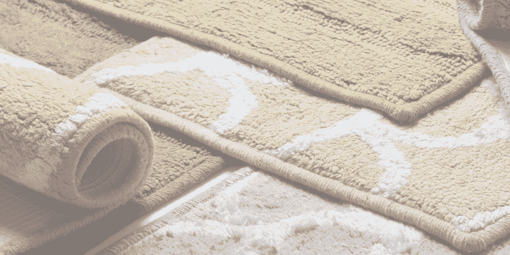

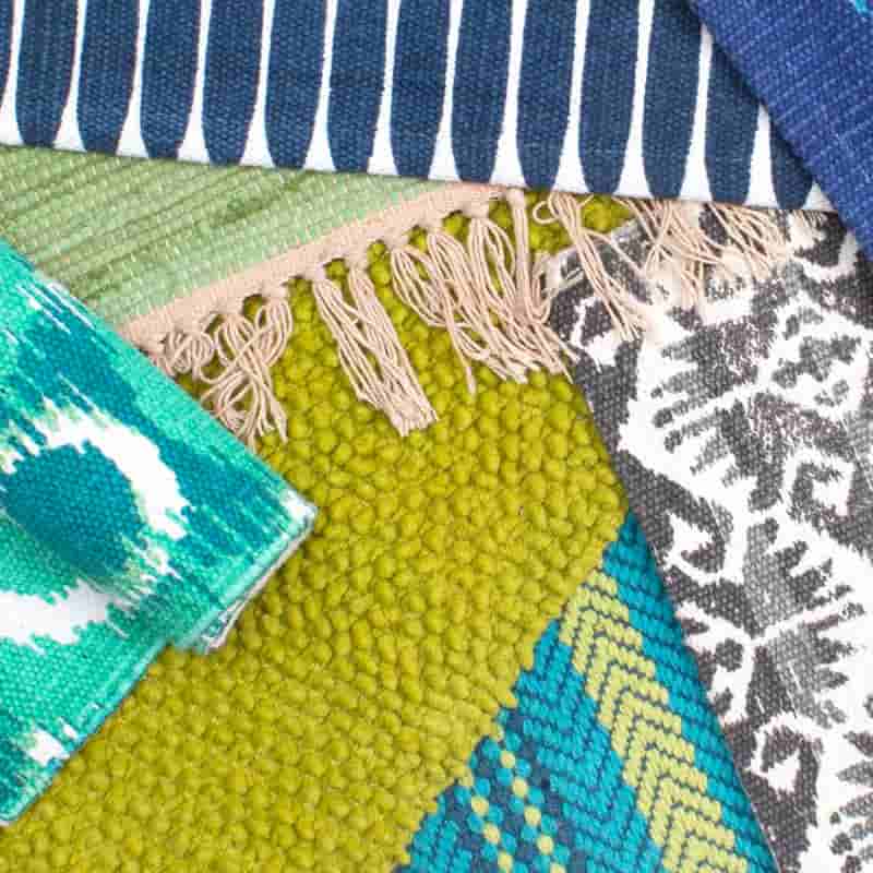
 E-COMHOUSE THIS INDIABACK TO PROJECTVIEW WEBSITEYour home is your personal canvas and the way you decorate it defines who you are as a person. House This believes that your homes are an extension of your personality and a canvas for you to express yourself.
House This India is a creative hub for home furnishings, their designs are bespoke and out of the box. The designer house create designs for people with refined sensibilities to the unconventional lot. This speaks of their creative ability and the earnest efforts for curating designs that are not only mesmerizing but functional and truly useful for the customer. They believe in environmental conservation and with this thought, House This India creates sustainable products. Their philosophy is to encourage you to take home not just beautiful motif on sheet but a small unnoticed part of this wonderful world we live in.
Deliverable
House This India, intended to showcase their unique designs to a larger audience and chose to take their business online with a equally enchanting website in place. Digital Impressions designed & developed a website keeping in the brand’s design principles. The website turned out to be sleek, colorful and interactive.
Services
Web Design & Development
Platform–
Developed in Magento, the website is accessible around mobile and desktop thereby creating a impeccable user interface. Magento is integrated with WordPress which makes it facile for feeding in blogs, feeds etc.
Website Structure
The website is structured in a way to make it look elegant and easy to navigate. A brief on each structure is discussed below,
Home Page –
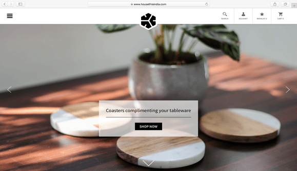
Design philosophy of “House This India” brand is being showcased on this website. The earnest efforts of the brand in creating products that keep the buyer’s spirit alive has been impeccably depicted in this website designed and developed by Digital Impressions. The home page opens to a full width banner slider displaying their product, the photos of the products displayed are so lively that it is sure to allure the visitors to scroll through the page.
A pop up for subscription and first purchase offer is strategically placed as a pop up at the home page to allure customers at a first look.
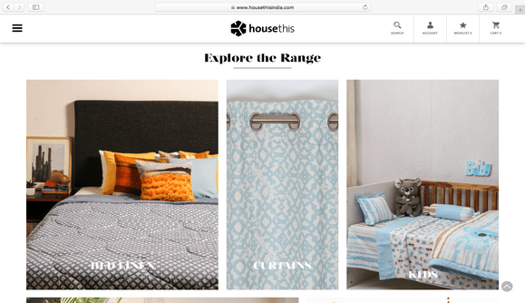
The product range is systematically listed in an array of product images, enabling a flawless shopping experience. The products in the home page has a “shop now” button, enabling the visitor to shop without having to retrace back and forth. A mouse hover on the product image indicates the product type to create a clutter free shopping experience.
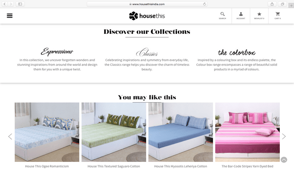
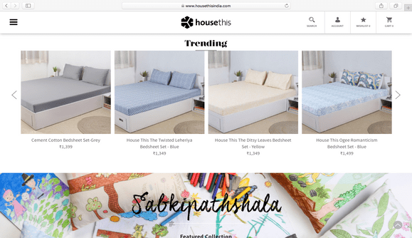
The design of the Homepage is such that, it gives a complete clarity of the product range, product collections, trending products and such other. A banner slider with collection category of the products is displayed, with a call to action button.
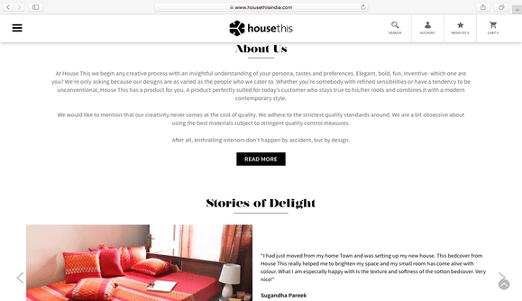
Snippets with the images of the product purchased and feedback is displayed in the stories of delight section in the homepage. The brand has partnered with big e-commerce companies such as Firstcry , hopscotch and such other.
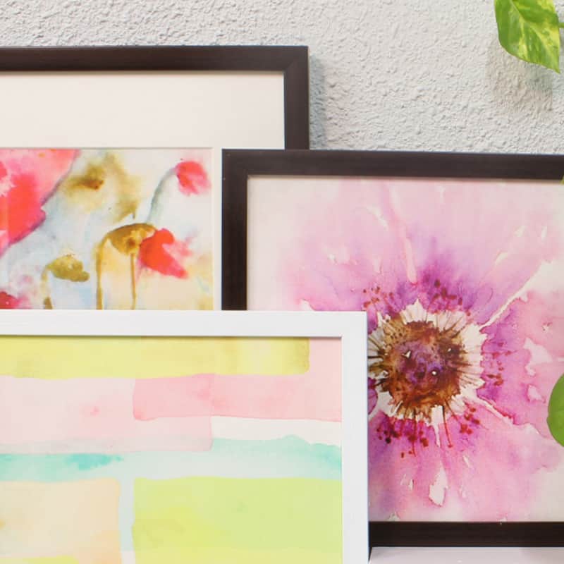
House This , collaborated with “Sabki Patashala” and taken an initiative of adapting artwork created by young underprivileged children. The collaboration is beautifully depicted with a full width photo encompassing the artwork of the children and brief on the initiative undertaken.
Product Listing Page –
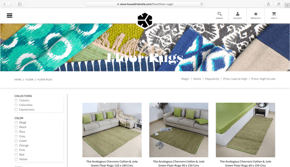
Each product listing page opens to a full width product banner. A sticky filter sorter is designed with varied options to enable the customers to narrow down to desired product. The chosen product range lists the product images and a call to action with a mouse over on the image. The product can be immediately added to cart or into the wish-list.
Product Page –
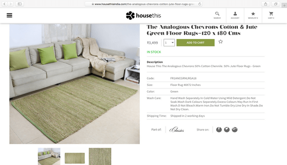
The chosen product is displayed with images shot in different angle, so as to enable the customer to understand the chosen products completely. A sticky sidebar indicates the size, product quantity , tariff and similar such options. Each product entails a creative brief along with the brand philosophy and exchange policies.
Shopping cart –
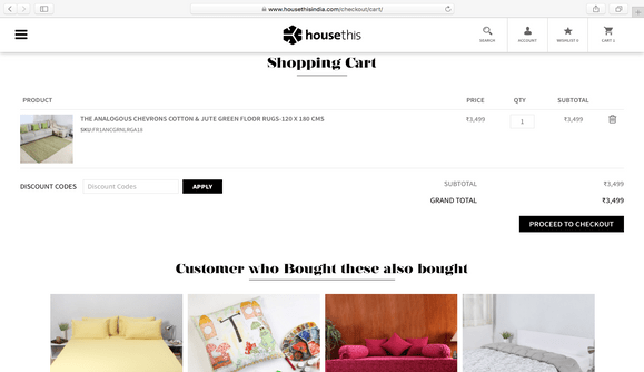
The page validates the chosen product by giving a product summary and provides an option for applying discount code if any, and then proceed to checkout. The page also displays the products customers bought. This is intended to ignite the customer’s mind to glance through the product listed and continue shopping!
Check Out Page –
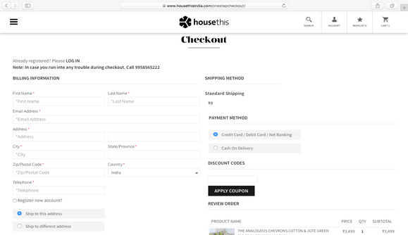
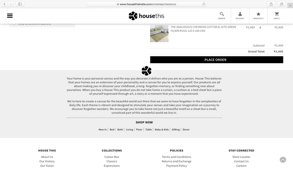
The checkout is a one step process, creating a clutter free experience for the shoppers. The checkout page entails Shipping address information, Payment method, Item Information and order review. Facebook is integrated in the website, enabling the customers login through the platforms. Additionally a contact number is provided for customers to send inquiry in case of check out difficulties.
Inventory Management – We have integrated Uniware of Unicommerce on the website to enable an end to end order fulfillment spanning from procurement, vendors to shipment, returns, real time view of inventory, master data management etc.
Payment Gateway Integration – PayU online payment solution are integrated in the website enabling secure transactions for customers.
House this india Ecommerce Website Preview
More Projects
Let’s chat...
but, you first!
AS SEEN ON


awards

Excellence
in Digital Marketing
Women CPO
of the year 2023
Transformational
Leaders to Watch
Most Trusted
Companies


